*Disclaimer: This project was completed prior to my formal training and subsequent employemnt in UX Design.
Create a new mobile application design with great detail being focused onthe User Experience. The design needs to be simpler with less clutter on the main screens. There should be more of a focus on the purpose of the application's main functionality.
For this project, I wanted to have a plan in place for the design prior to the work being done. I sketched wireframes, chose colour and branding, and went through multiple versions before being satisfied with the result. I also wanted to work with more strict gridlines and consistent objects. As a result, I tried to re-use as many buttons and layouts as possible to maintain consistency.
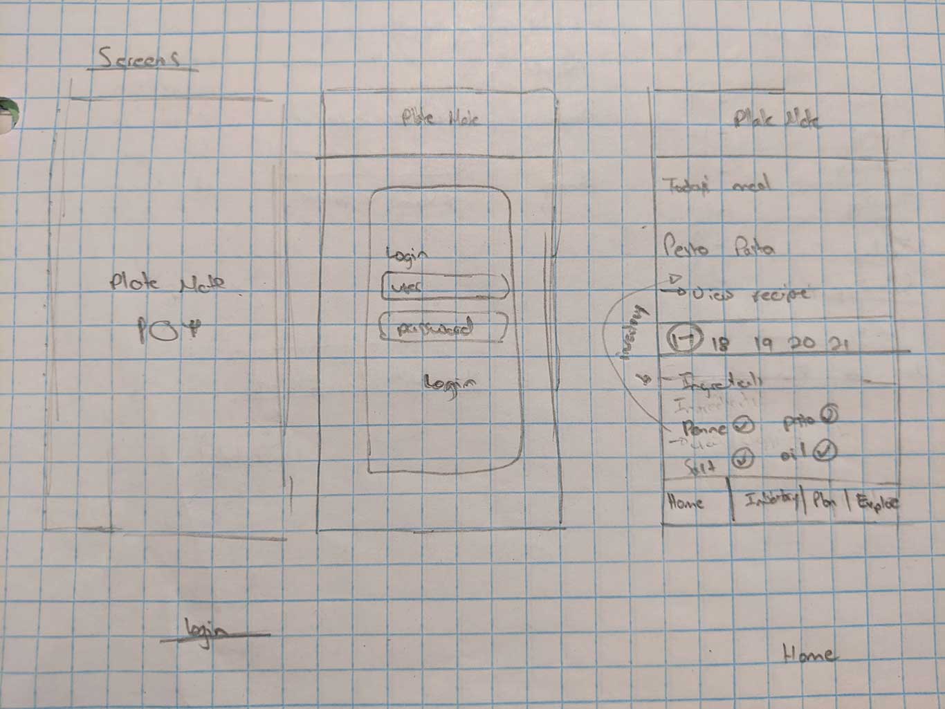
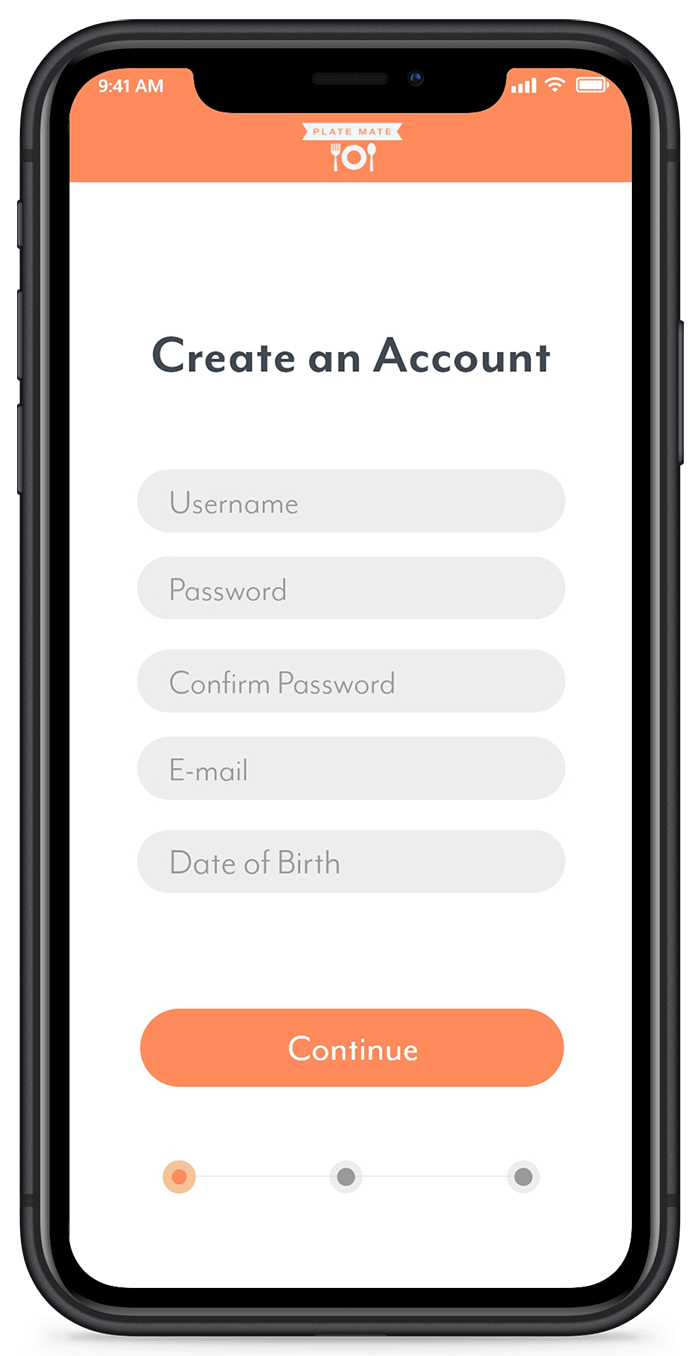
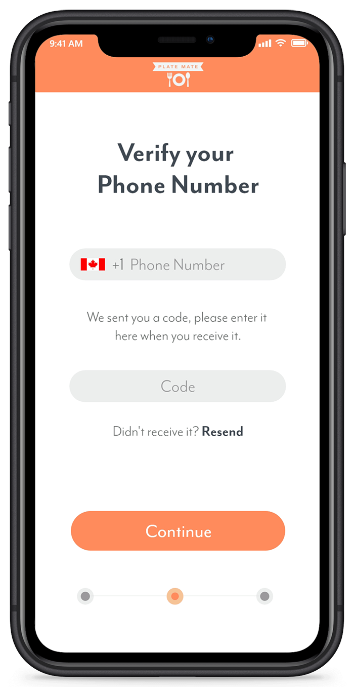
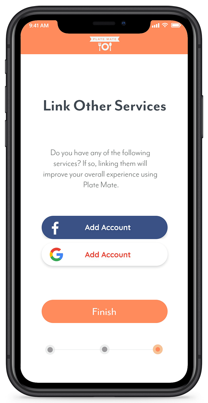
The sign-up process follows a three step method and includes sign in options with other services. This is a key feature for this project since the shopping list could be imported/exported to services like Google's Lists.
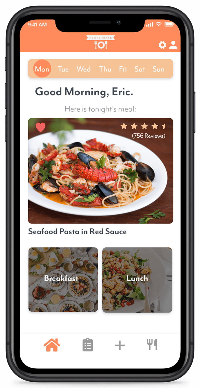
The home screen is designed to show the user exactly what they need to know for a given day's meal plan. The largest image will be dinner as it is likely the most intricate and demanding out of the three meals. Tapping the different menus will reveal the recipe. Breakfast and lunch can also be displayed by taping the objects. The user can also look forward to the next day's meals as well using the top dates.
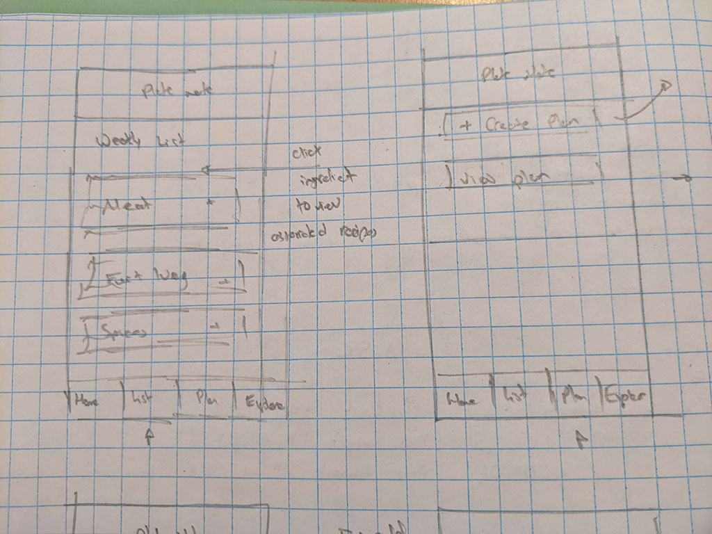
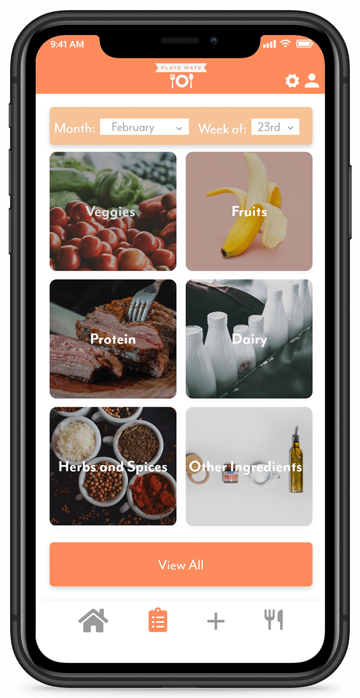
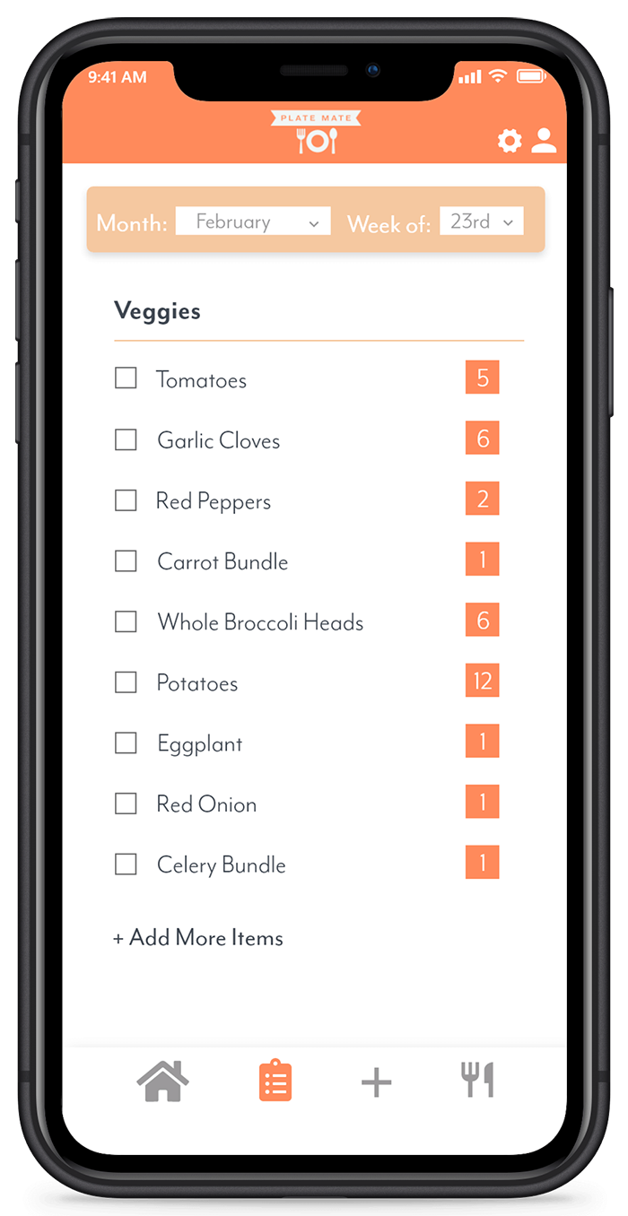
The grocery list allows the user to view all the ingredients needed to make the current week's meals. The list is populated automatically based on the recipes that were added to your plan. Items are split into multiple categories such as veggies, fruits, and protein. Users can also check off items they have purchased (or may already have in the house), or add items manually to the list.
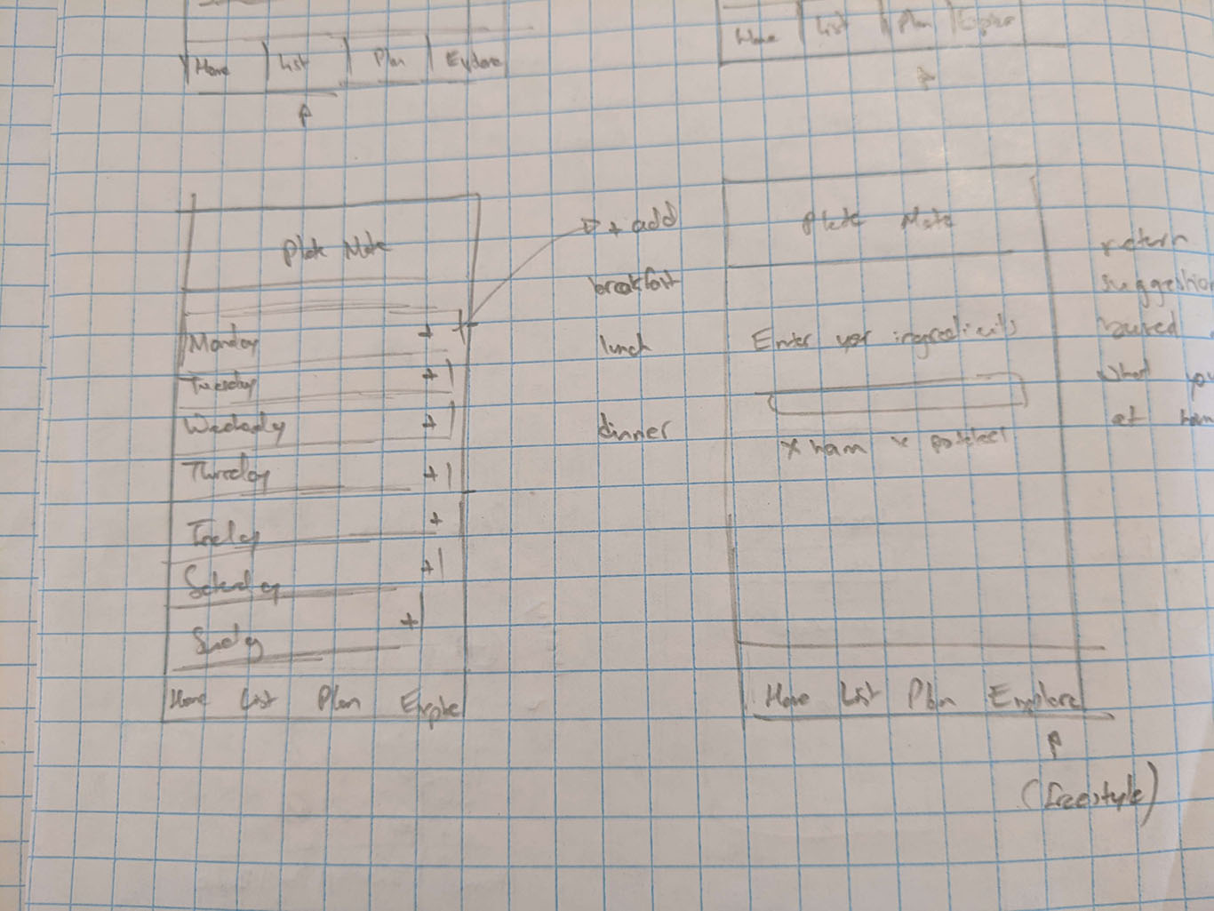
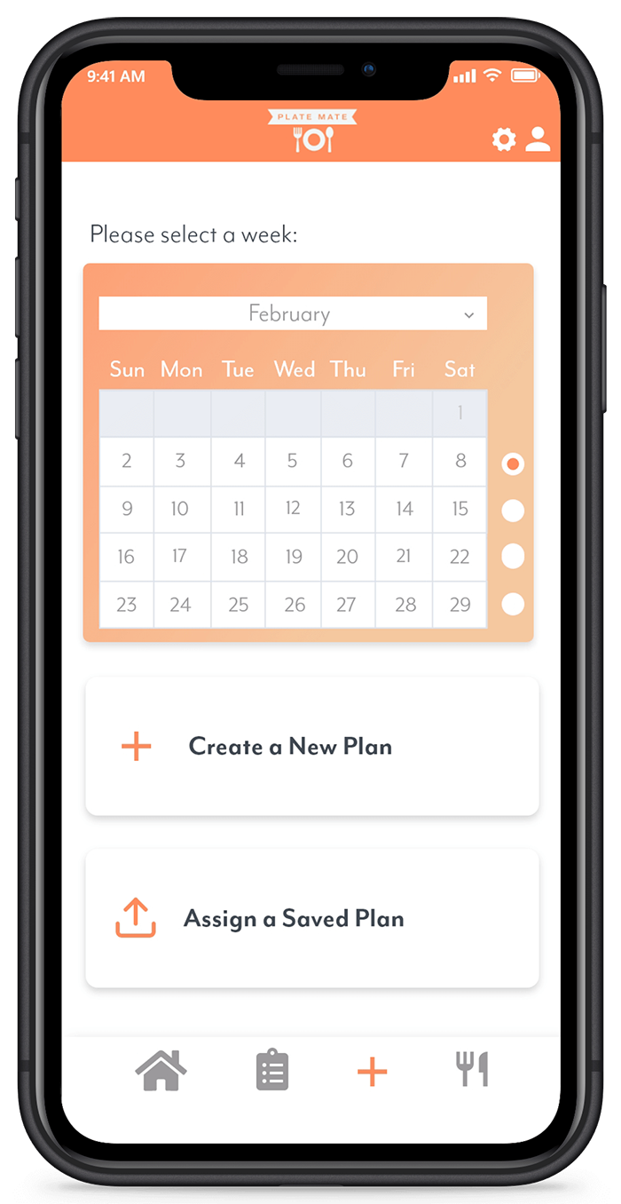
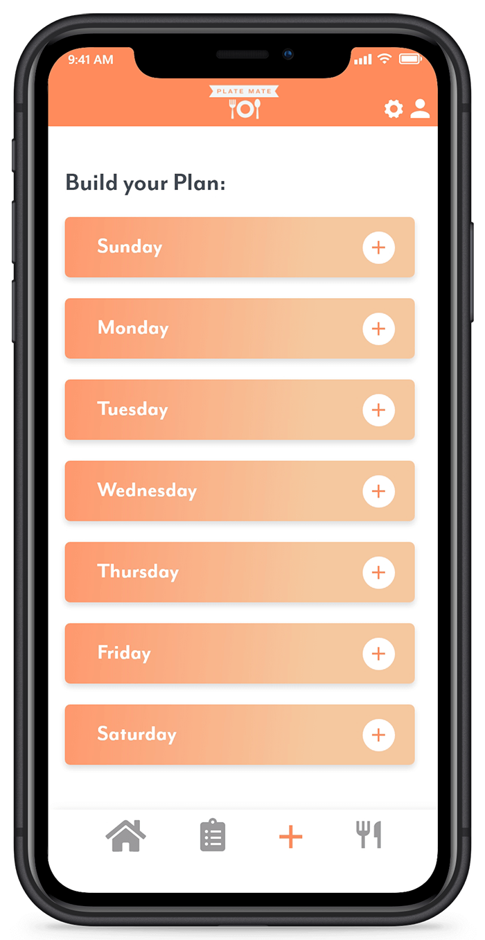
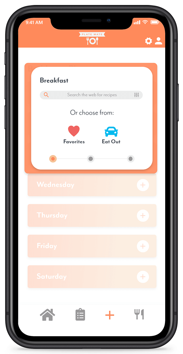
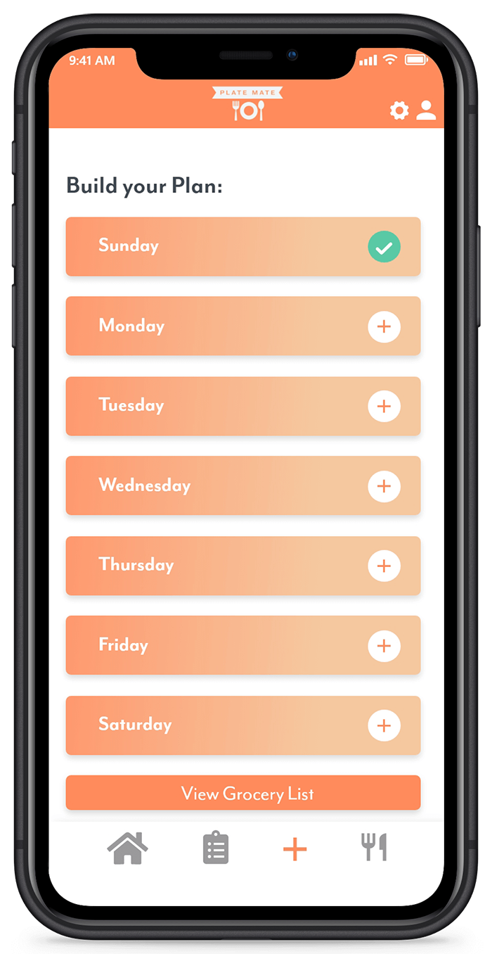
Users can plan their upcoming weeks meal's directly through the app interface. Users select a week and either create a new plan, or they can assign a favourite plan that had been previously saved. From there, the user will add meals day by day by searching for recipes online or choosing from favourites. If the user knows they will be eating out for a particular meal, they can also choose this option. Once completed, the user is shown a completed grocery list of their created plan.
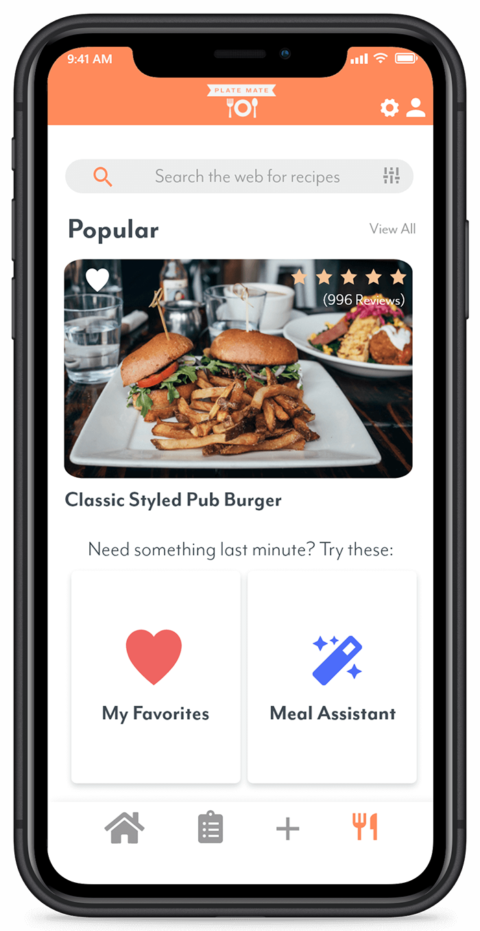
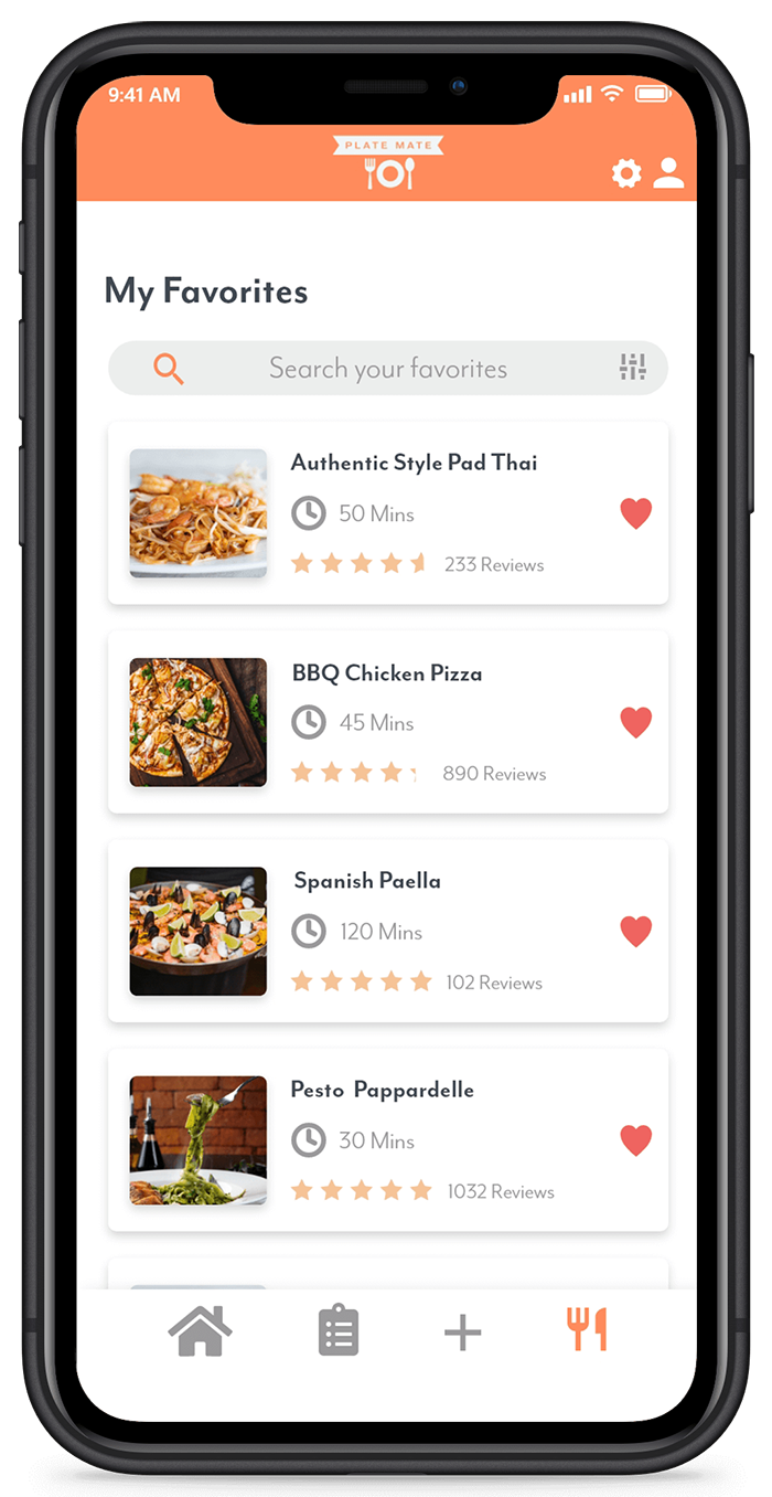
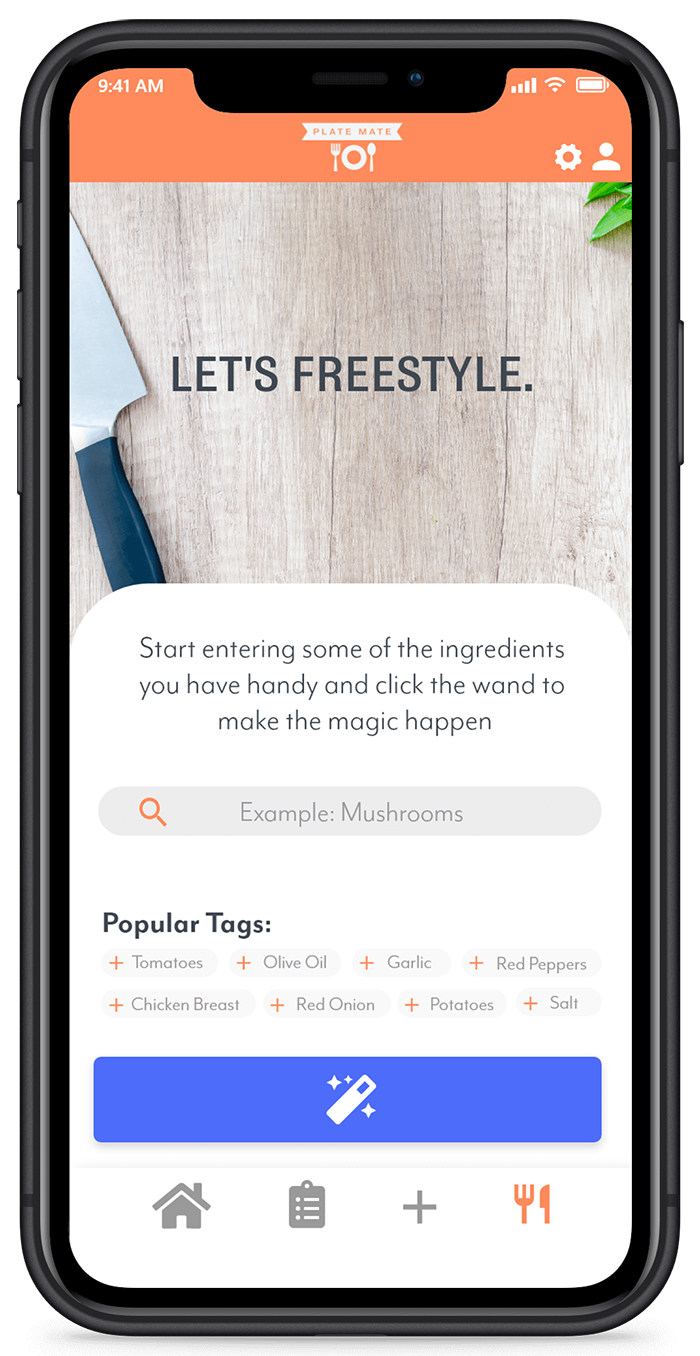
The explore tab contains the extra features the app has built in. The main screen shows popular recipes that can easily be added to a user's list of favorites. These users can also easily view and edit their favorites list from this tab. Another part of this app is the ability to use the meal assistant to provide suggestions to you for a particular meal. If a user changes their mind and wants a different suggestion, you can enter popular ingredients into the suggestion bar. The magician will return a list of recipes based on the ingredients tagged and popularity.
After completing this project I feel as though I have learned a lot since my first attempt. I attempted to scale back content per page in favour of a more minimal design and I think the outcome was more professional. I also think that paying attention in advance to how the user will navigate the app paid dividends when it came time to design. Finally, I believe I took strides in terms of text hierarchy in my design.