4. So How Does This All Work?
You may be reading the setup process and be completely confused but don’t worry, its really not too hard.
Here is what's really happening:
Sass file types all use “.scss” extensions. Sass is itself a scripting language but what it really is most
important for is it’s preprocessing power. When styling with Sass, all the CSS changes are actually made in
the “.scss” named files. After saving, these styles get rolled up into a “main.css” file that lives in my
“dist” folder, meaning I never actually touch a “.css” file. The main advantage of using Sass is that you are
able to take advantage of it's built in extra functionality, such as the ability to nest CSS conditions, or
other functionality
such as configuring variables. In this case, I’m running Sass through Node.Js
which is more prominently for, you guessed it, JavaScript. As for the live server extension, having it
installed makes previewing my work simple. By opening your HTML in Live Server, you get a preview of your web
project that refreshes automatically everytime you save changes in VSCode.
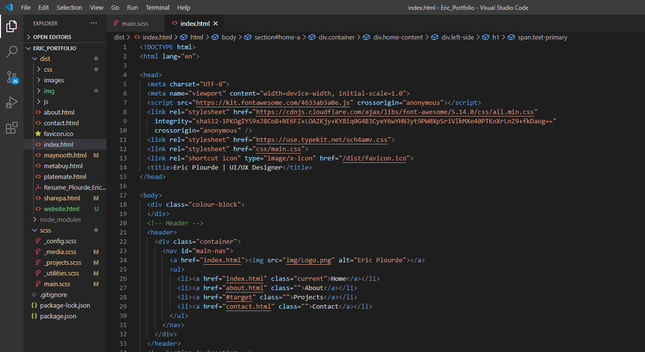
A Screenshot of my VSCode space for reference of my file folder structures.
5. Responsiveness and JavaScript
After pages had been made marked up for desktop, it was necessary to validate my site for devices such as
mobile
phones, tablets, and others. To preview how this may look, I just used the built in Dev Tools for Google
Chrome. Optimizing for mobile is a pretty simple but slightly tedious fix if you use CSS media queries.
Essentially, I would
set a max width for the screen size in question and apply little fixes along the way using selectors. Think
of something like the main navigation bar. What happens for mobile phones? It doesn’t really make sense to
cram it all horizontally, so instead I set the flex-direction property to column so that my logo stacks on
top of the menu items.
You may also notice some cool features like the typewriter effect on the home page, or the ability to use a
lightbox for images. These are great examples of how JavaScript can liven up a web page and bring
functionality over that is impossible to replicate using HTML/CSS alone. Unfortunately, I haven’t gotten far
enough to program these functions myself yet, but luckily GitHub has many of such scripts available for free
to be used.
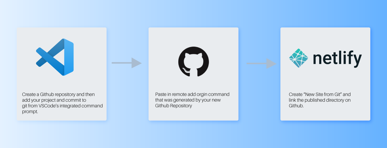
Deployment
After searching for a place to host my site online, I ended up choosing the recommended option through the
course which was to use Netlify, a largely free service, as my dedicated Host. Netlify offered solutions for
my contact form as well as a literal zero-dollar cost of service, two of my site improvement goals.
Moreover, since my website would likely only
see low to moderate traffic, it made even more sense. The way to deploy the site was really simple
and only really involved three steps:
Lessons Learned
After undertaking this personal project, I honestly feel extremely satisfied. I certainly understand that
I’m only scratching the surface of web development but overall, I really think I have a better understanding
of the other half of the process that a developer is responsible. Having said that, I could see how this
would be a drawback since understanding how hard something is to code could stifle creativity. Despite this
consideration, I think that having skills to contribute on the HTML/CSS side of the project outweigh this
negative consideration. Having empathy and being able to speak the same language as others who may play a
different role than you on a team is invaluable, and I certainly think adding this skillset to my playbook
is incredibly important. Going forward, I’m hoping I can continue learning about HTML/CSS and perhaps my
next course I take will teach me more about the world of JavaScript and even edging closer to being able to
operate as a UX/UI Developer.
If you’re reading this case and were in the same situation as me with no prior experience building a
website, I highly recommend trying it. These are the type of skills that could only be learned practically.
The course I took was exceptional, but the real payout comes after you try applying what you learned. As a
UX Designer, being able to have this empathy I discussed above for developers is really eye opening and I
think as creative people it’s a great thing to better understand the technologies used to make our visions
come to life!